��Ŀ���ڵ�:�����ڿ���Ѷ����һ�㣨�йش���������200�ף�
���ʱ�䣺2006��3��
��Ƹ����ˣ� Patrick Leung
���˵��
���λ�ڱ����йش���������� (��ƻ����2006�ꁆ̫�^�҃��OӋ�����͏d�M������)���������Ҽ��˵�,�������ҵ�IJ�ʽ��ͬ���ǻ������ȴ���в�ͬ.�ͻ�ϣ��ÿһ�Ҳ����Ļ�������ܹ�������Χ��������Ҫ��ȺIT����Ŀ�ζ,��Щ�����˽��ܽ�����������,�����ڲ�������Ͼ������ͳ����Ĺ���,
���Dz����ִ���ʽ�ľͲͻ���,�ô�ͳ���Ϻ��˸��˶�Ŀһ�µ�ӡ��.
��һ��ƹ����dzɹ�����Ϊ�����ڿ�ҵ��ܿ�Ϳ�����
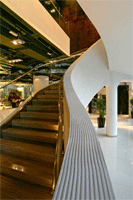
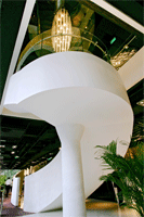
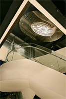
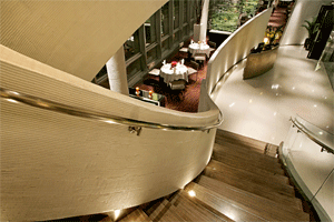
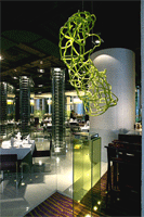
������������,�������dz���,һ�������һ��Ͳ���,�����ǹ������.������֮����Ҫһ����¥��,���Ǿ�������һ6�ߵ�¥�ݵ���,����һ��λ����������Ļ����ݲ���Ϊһ����Ȥ���Ӿ�����,���εķ���Ҳ����������������˽�˾Ͳ���.
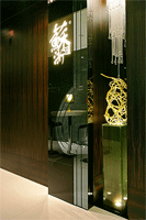
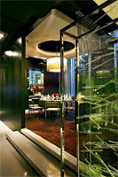
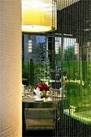
��һ��Ȥ������Dz����м������, �ϰٸ�40cm�� ֱ��2 cm�������������ڻ�ɫ������֮��,��ƴ������ϴ��Ӫ��Ϸ���Ե�����Ч��
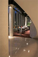
�ִ��ķǴ�ͳ���Ҳ��Ӧ�ڶ���,����,�ƹ��ǽ��Ĵ�������,6�ߵĶ���������ʽ������ɺ�ɫ,���йܵ�Ҳ��ɺ�ɫ,�ذ����Ǹɾ�Ư���İ�ɫ����ʯ,���е�ǽ���������ر�������Ĩ�һ���ľ����������ʱ�к�ǰ����ӡ��.
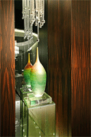
�����ڲ������˺ܶ�����Ʒ�滭�͵��ܽ���װ�κ��ر�Ķ���,��Ӫ���ʺ������͵�������Χ.
Concept
This is a Shanghais cuisine restaurant located at Beijing. The
client is a group having a famous brand name and has opened 7 restaurants
within the region. Although it serve similar food but the d��cor of each
restaurant is totally different. The client was expecting appraised ambience
to each restaurant to suit the customers nearby. This one is situated
at ground floor of the modern commercial building where most of offices
are IT business. Staff is generally belonging to the young generation
who can accept new ideas. This restaurant is particularly designed to
avoid tradition Chinese motif, give a totally new touch of modern western
dining ambience that make customers a new perspective to the tradition
Shanghais food.
The design approach is successful since lots of comers within short period
of time after opening.
The restaurant has three floors, the basement is the kitchen, the ground
floor is general dining area and the first floor is the VIP dining rooms.
A new stair linking the upper and lower dining area need to be designed.
This 6 meters high stair is constructed as a piece of sculpture. It is
a curved shaped steel structure located at the central part of the area
and it becomes a very interesting feature. The curved handrail also led
to the panel screen off the western side private ding area of the ground
floor.
One other fun feature within the restaurant is the screen design where
it put between tables. The design is collection of hundreds of 40 cm.long;
2cm. diameters clear glass rods floated irregularly in front of the sandwiched
yellow tined glass panel. The spotlight from the bottom that gives a dramatic
and artistic touch illuminates it.
The contemporary and non-traditional design also reflected on the treatment
of ceiling, floor, lighting and wall finishing. The six meters high ceiling
is treated as open ceiling and painted in black paint. All ducts and wiring
are painted black that look appears as sculptural effect. Floor is finish
in white reconstition marble that looks chic and clean. Most walls and
columns are finished with either textured plaster or ebony wood veneer
to give a sharp and trendy look.
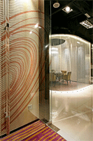
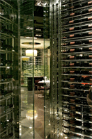
The interior is very much decorated with lots of artworks, paintings and
sculptures. Those art pieces are special designed and costumed made to
suit different areas within the restaurant. It brings the whole interior
in a mood of artistic and exciting that make dining become joyful. |
|
|
 |
|


